How to Read a Book a Week

This article has a great tip on reading non-fiction: do not read non-fiction word-for-word like fiction books. Fiction requires that the reader immerse in the author’s world. Non-fiction tries to convey an idea.

Here is method from linked article.

  1. Start with the author
  2. Read the title, the subtitle, the front flap, and the table of contents.
  3. Read the introduction and the conclusion.
  4. Read/skim each chapter.
  5. End with the table of contents again.

See the original article for the full explanation of the method.

Tab colors in iTerm2

I’m old school and still do much work in a terminal. My preferred terminal is iTerm2. I use multiple windows and multiple tabs/window. I tend to have lots of suspended work or session, which I keep in tabs. It is convenient to use separate tabs for each task for many reasons. Unfortunately, it is often difficult to find the correct tab when there is time to return to the task.

I have started using colored tabs as a way to (more) quickly identify tabs. The problem is that tab colors are a menu item (I prefer command line) and most of the default tab colors are ugly.

My solution is Ken Snyder’s tab colors. Thanks, Ken.

Creative graphing

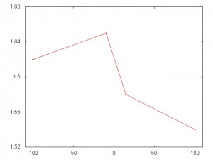
Most graphs use zero for the origin of the X and Y axes. In a some cases, it is better to use a different origin. Because this is unusual, the present should take care to note the atypical origin in order to not confuse or fool the audience. In some cases, those who fail to do this fool themselves. Case in point, consider the graph below, which appeared here.

fb-relationship-graph

This appears to show a big difference. Until you look at the y-axis and see that the difference between the high and low is 0.11 posts/day. This is about a 7% over all change, which may be significant. But the graph is highly misleading.

To prove the point a facsimile of the original graph is presented below.

a

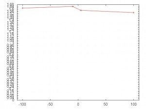
And here it is with 0 as the origin of the Y-axis.20120918_184854.jpg

b

As noted above, this variation of 0.11 posts/day may be significant. But the unzoomed plot gives a better understanding of the magnitude of the change.