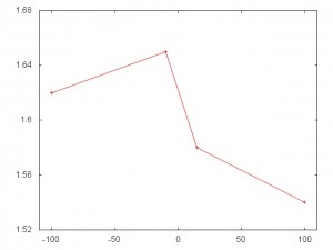
Most graphs use zero for the origin of the X and Y axes. In a some cases, it is better to use a different origin. Because this is unusual, the present should take care to note the atypical origin in order to not confuse or fool the audience. In some cases, those who fail to do this fool themselves. Case in point, consider the graph below, which appeared here.

This appears to show a big difference. Until you look at the y-axis and see that the difference between the high and low is 0.11 posts/day. This is about a 7% over all change, which may be significant. But the graph is highly misleading.
To prove the point a facsimile of the original graph is presented below.
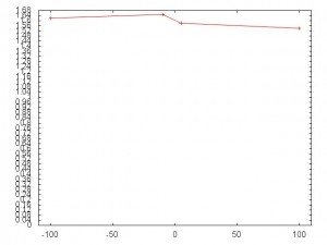
And here it is with 0 as the origin of the Y-axis.![]()
As noted above, this variation of 0.11 posts/day may be significant. But the unzoomed plot gives a better understanding of the magnitude of the change.


